Search This Blog

Wednesday, December 8, 2010

Week- Finals (Abandoned OZ)

Original
"half -way" done


Final Version

Brushes


The title of my piece is "Abandoned OZ". 
Concept: This is how I would imagine an abandoned building in OZ might look like if it were abandoned. The green is sparse, and it's dreary.

Craft: I used my own brushes and 4 pictures provided by Nate to create this image. The yellow brick road was created using biscuits! I used layers of the brushes to create a "cartoon" version of this collage, and then I added in a few made-up details like rain and mudd puddles and grass. I used the eraser and the magic wand tool to make the shapes correct. The brushes I used include a rasinets pack as brick, and a star of david for the clouds!  I used color to represent space and time rather than using shadow effects.

Composition: I set up the picture to have an obvious foreground featuring the yellow brick road and a very separate sky. the building is slightly to the left so that the yellow brick road can be extended at an angle. I originally was going to include keys into the picture, but it was throwing it off balance so it ultimately din't work compositionally and was left out. 

Sunday, December 5, 2010

week 14-Magic

Assignment: Using just brushes, create something magical!


Craft:
 I used just brushes. Many of them are ones that I created, and others include a round brush, and the starry one used for the magic coming from the wand. The wand was made form a lipgloss brush. other shapes include a penny (the buttons), and a star pendant (his hat). 
Concept: 
Elves are magical, and sometimes use wands to look cool. 
Composition:
It is very obviously an elf, using obvious christmas colors for his outfit and he has human qualities to him but not too many so that he remains mystical. It's very straight-forward compositionally.  

Special Edition Blog- Extra Credit Yo


"Flattery Gets you Everywhere" by Laura Raymond. 2010

this is Nate

Concept: Creep Nate out/ possibly flatter him to increase chance of a good grade in the class with this extra credit blog.

Craft: I made a brush out of a sketch of Nate, then applied it using only blacks and grays all over the page until the page was covered by the image. I used my signature brush to sign the image.

Composition: One of the brush strokes is especially darker and this makes sure you can see details that the other strokes leave out due to the lightness of color. 

"Covered Up"

Craft: The color orange for the background, white for the brush. One stroke.  Brush made from a mask that I drew on and scanned in. 

Concept: This is a representation of how I feel about communicating my ministry when I'm not practicing it, through my peer minister position.

Composition: There are many things, even though it was turned into one brush. There is a tree on top to represent the Renew program, a mask over one eye to represent hiding motives, and the bottom of the face is half coexist, a religious cohesion statement of tolerance, and my version of the beach with waves & sand to represent retreats. It has a good balance and color doesnt clash. 

Monday, November 29, 2010

week 15- portrait

This is my little cousin Gavin eating ice cream.


Craft:
 I used several brushes including a simple round brush, and a feathery looking brush for the details on the hair, the eyelashes, and the eyebrow. I traced out the parts of the image that I wanted to use and colored them in arbitrarily, layer by layer. Then after color and basic shapes were applied I added detailed strokes and some shadow/hi-lighting. I used my signature brush to sign the image. The eraser tool was used to define boundaries and shape the image. 


Monday, November 15, 2010

Week 13- Organic & Manufactured

"Catwalk"
This looks 1,000,000 X more dramatic printed.
Craft: I used the scanner to put images onto a computer. used here you will see 1) a sock. 2) a coin purse, 3) a flower, 4) a clover. I used the magnetic tool to cut out the clover. I used the rectangle marquee tool for her chest, neck, arms, hair, and legs. I used the elliptical tool for her face, ears, and the berry. I used Hue/Saturation as well as brightness/contrast to make the sock red to be used as the carpet, and for the clovers turned into berry leaves, and for her hair. I used the eraser tool to shape most of the shapes. 

Concept: This is a depiction of a female on a catwalk, the red carpet specifically. she is devoid of features, including her hands and feet. She is all blue. These elements give her a specific lonliness that is understood to be experienced by people who are always around people, but the people are never really with them. 

Composition: She is at the top of the carpet, and the area around her is devoid of color. she's wearing a hat, in fact she is wearing all red and green and the berry and leaves give us a feeling of capitol C Christmas. she looks very alone.

Sunday, November 7, 2010

Week 12- ¡Make It POP!


Craft:
(top row) I used my photographs taken with my camera. All of the pics are outside in the VAC neighborhood. I used the multiply opacity effect on the image. I created a color layer with a dark brownish-yellow. I created 3 other layers, each used to color a different object in the photo using paint brush, and perfecting the edges with the eraser tool. All coloring is monochromatic and stays within the yellow range. 
(bottom row) this was the in class assignment. I used an image found in the MMC on campus of two candles, a basket, and a cross. I used the same process as above, but this image uses the color red, and only displays one object per photo, and you will notice it is the same photo repeated. 

Concept:
(top row) All of these photos are on the street, and have houses in the background. The point is to draw attention to specific objects in the photo. 
(bottom row) to display a different specific object that may not be noticed first normally. 

Composition:
(top row) The photos are well balanced with the objects drawing attention being in different areas but of similar spacing in relation to each other. I purposely included 3 photos with a house in the background, and they are shown in order of the house being farthest away to closest. 
(bottom row) this is a found photo, and it is balanced with four items. I chose not to display the cross because it is the darkest item and most forefront item already. the entire class used red, so that goes along with all of our themes. 

** Final updates 

Monday, November 1, 2010

Week 11- AD


Craft:
(see last week) and I enlarged the toy and added a drop shadow in front of the box. I added new words using the same colors and font types as are on the box.

Composition:
I placed the boxed toy behind the unboxed toy so that you could see the package, but more importantly see a full view of Lots-O-Touchin Beaver! I included a tagline about a former product, and the copyright information about the brand parents trust.

Concept: Sell you Lots-O-Touchin Beaver! You can touch him EVERYWHERE!

Sunday, October 31, 2010

Special Edition Blog- AIC

One pic of me @ AIC

  
One pic of Nate @ Art Institute Chicago


1. "Public Notice 3" by Jitish Kallat
Craft: He used rubber, plastic, LED lamps, & wire. He used the main stairs inside of the AIC to display the art, and he used the words of a speech by Swami Vivekananda given at the AI in 1893. he purposely used the colors red, orange, yellow, blue and green.

Concept: This piece is representative of historical and political unrest that has existed, and that recreates itself in different forms. He is connecting Sept 11, 2001 with Sept 11, 1893-- a speech meant to advocate for ending bigotry, and the event that will define my generation with the fall of the twin towers, and the problems that we are facing now which are very similar to those experienced 100 years earlier. He states that the colors used represent Homeland Security warning colors/ "threat conditions". highest threat to lowest threat the order is red, orange, yellow, blue, green.

Composition: He uses the entire speech by Vivekananda which shows how important his message is to Kallat. The large scale of the message is also a big part of the piece. He wants to she how important it is to see the solutions that have been placed to modern problems in past experiences, specifically with the prejudices associated with 9/11. he makes some words certain colors to show urgency. though many of the words are different colors, a few strings of words are colored together, and I believe these words are most significant to Kallat. 


couldn't get this guy rotated
2. "The Captive Slave" by John Philip Simpson

Craft: oil on canvas. it's a two-tone painting, there are the browns and grats in the background and his skin, and then the reddish outfit. the figure is sitting with the light coming form the top right.

Concept: this was painted in the early-mid 1800s when slavery was still very present. it predates the English abolition of slavery. It shows the man looking despairingly for a sign of hope, he seems to be captive by more than just a physical prison.

Composition: I notice that unlike most white figures, he does not appear to be displayed as muscular, but he's actually kind of skinny with his bones sticking out, while still in a manly position, and again at the same time looks submissive. he is an awkward in between of a lot of things, like this painting was where public perception meets legitimate placement of the then modern black man at a halfway point. The artist purposely keeps the background dark to keep the mood unhappy and he plays with shadows. There are a lot of shadow detail particularly in the folds of his outfit. 

ditto

3. "In The Magic Mirror" by Paul Klee

craft: oil on canvas, on board. he uses a harsh, what looks kind of like a dry brush for the background and the coloring of the portrait, but then uses distinct bold lines to make her entire face, and the little heart in the bottom right corner. 

Concept: I think this is his visual representation of beauty. rosie cheeks, fair skin, small features, longer hair. It is probably not a real person, but a made up vision.  if she is real, she is probably a mean person with a black heart.
   
composition: amorphous shapes, lines, and then the heart that doesn't quite belong because of it's contrasting colors and being symmetrical. It is also not even close to being life-size, and since it is so dark, it kind of draws my eye to it early. I see her hair, then the heart, then her mouth--the line of her face, and then her eyes. I think you are supposed to see the heart first to perhaps make a bad association with her!

Wednesday, October 27, 2010

Week 10- Box

Made a box for my misfit toy! pshyeah!
        
How'd I do that? (Craft)
I used several layers to make the box. First, a rectangle using the eliptical tool. Then, another rectangle the same way and before clicking out of it I pressed delete to make a hole in the first rectangle. Then I made the top and side view of the box by making more rectangle shapes, and then used transform > distort to make them the correct angles. I then Made yet another rectangle to use as the background of the box. then I made a rectangle and applied a gradient effect to it to make the plastic on the box. I used the circle eliptical tool to put a hole through the plastic layer. To get the part of the box that slightly overlaps, I used the lasso tool to draw a connecting shape. To make the phallic shaped cutout, I used the round eliptical tool on the front rectangle layer. That's all folks!

Why'd I want it to look like this? (Composition)
Box: I decided to make the box red because it is a very bright primary color, and it has the potential to appeal both girls and boys, though my main target is little boys. The only other color present is yellow, also a primary color. Both of these colors coordinate with the toy's actual colors as well. I put a child in the corner of the box grabbing at the penis, and a big finger on the opposite side pointing to the penis for your child to try touching the penis. In the upper left below the name of the toy, it says the phrase "you can touch me everywhere!". This is the catch phrase and the attraction of the toy. Most of the fonts used are very easy to read for toddlers just learning those skills. In the upper right corner below the company name, it says "step 2" so that parents know what age is appropriate for this toy. 

what's the point?(Concept)
I want you to buy 
Lots-O-Touchin' Beaver! "You can touch me EVERYWHERE!"

Tuesday, October 19, 2010

Week 9- Misfit Toy First Draft

Craft: I used the text (i'll look up what the text is called), select/eliptical tool, the lasso, & the eraser tools to cut out the toy and arm,  and make the words. The arm has been had it's saturation hue and value varied to brighten it to fit the picture a little better. I used the image of the chest and phallic from here: http://patelladengkul.student.umm.ac.id/2010/02/09/hello-world/ 

Concept: Lots-O-Touchin' Beaver! You can touch it anywhere! (more connotations than a bear, and it's kind of an androgynous being). 

Composition: I fused the body parts over the toy to make it seem drawn on. I took off the tag of the toy's head and gave him a little "skin graft". I placed the hand reaching inappropriately at the crotch to more than suggest the toy's purpose and I put bright text above the toy's head. I would like to make a more 3-D crotch and possibly boobs for next week and actually have an image of a child instead of the creepy hand.


inspiration: http://www.forbrideandbaby.com/baby-toddler/soft-cuddly-stuffed-animal-gifts/


Monday, October 18, 2010

Week 8- Misfit Toy Proposal


Craft: I drew out this plan of action and have taken some inspirational photos of possible items to be used.

Concept: The Lots-O-touchin Bear: You can touch him everywhere!

Composition: I plan to set it up like an AD, with a child touching the bear and a parent approving of the child in the background. I may add a child that is freaked out by the bear as well. The oddity being expressed is pedophilia/ acceptance of invading the space bubble.

Monday, October 4, 2010

Week 7-Gamer Concentration


Craft:
The craft of these artworks includes using photoshop. For the first image, I used the magnetic lasso and the eraser tools to cut out the individual images. The backgrounds use filters (extrude) and variations of color, saturation(it's very saturated), and hue. The floating balls I desaturated and then added a monochrome color scale to, then changed the saturation. 3 of the orbs have a dissolve filtered background shadow which i made by just copying the image and placing the filtered image behind it.  I copied and pasted the image of the gamer and her glow from the second image.(see below for description)

For the second Image, On the gamer to make her very vivid I simply toyed with the adjustments saturation, hue, and her vibrance. To get the glow behind the gamer, I made a copy of her and then added a glow effect to it, and then changed the opacity of the image. The background has the render effect here as well, but the background was desaturated and then color changed. The orbs were copy pasted from an earlier image where the lasso tool and eraser tool was used to cut the single image of a ball lantern out and then copied and pasted using the transform tool to make them different sizes. then once in this image, they were desaturated before I picked different colors to change them each to. They also have 3 with the dissolve effect background.

The third image is most like the original because it is least saturated and has more of the original color. The orbs, though originally were a yellowish color, have been enhanced which smoothes out the edges with it's intensity. I used the above aforementioned lasso and eraser tools to put the gamer, her glow and the orbs there. I did slightly desaturate the background and adjusted the light levels to make sure that the gamer and the orbs pop more than the colors on the ground. The original filter on the gamer I don't remember but I believe it was a strokes filter. The other elements have already been discussed above.

Concept: My concept is now Gamer Concentration.
The person is trying to avoid glowing orbs. She clearly is focused on achieving her task! The orbs are floating and Rhonda is rapidly being moved toward them. It's most comparable to a game of snake, you have to redirect her position to keep her alive in the game. I think that it looks like something I would want to go over and pick up controls for. 

Composition: The ground is supposed to feel like it is moving Rhonda forward, and she is being forced into the orbs. The photo that stands alone below, an extra edit that I compiled this week, combines the qualities that work best from the other three photos. It is probably the most balanced. She most looks like she is in a virtual reality. 


Monday, September 27, 2010

Week 6- Variations


Craft: The assignment was to use value, hue, and saturation. The top left image is hue, the top right is value, and the bottom left is saturation. For hue, I changed the background to a single color after desaturating it, and made the orbs multi-colored. Rhonda has been played with over all three color changing variations and is now multi-colored too. for value, I chose a single color scheme, and made the background completely desaturated. I increased light measures on the orbs and Rhonda to give them more of a glow. The positions of the balls have remained the same throughout because I have changed it many times during the project, and this is the position that I felt gave it the most balance. The guitar hero body has been manipulated to a point where it no longer screams "Guitar Hero" to someone who is unfamiliar with the origins of this project. This is also true with the orbs, which started out as paper lanterns but now look like glowy balls. 

Concept: My concept is now Gamer. The person is trying to avoid glowing orbs. She clearly is focused on achieving her task! The orbs are floating and Rhonda is rapidly being moved toward them. It's most comparable to a game of snake, you have to redirect her position to keep her alive in the game. I think that it looks like something I would want to go over and pick up controls for. 

Composition: The ground is supposed to feel like it is moving Rhonda forward, and she is being forced into the orbs. The photo that stands alone below, an extra edit that I compiled this week, combines the qualities that work best from the other three photos. It is probably the most balanced. I guess I'll tell you about what was unbalanced. In the top left pic, the multiple orb colors are really cool, but it takes the attention too much away from Rhonda, who is the subject in this game. The top right pic makes the moving ground too unimportant without color. and the bottom left pic, though the balls look cool are too messy for their purpose and Rhonda looks less like she is in a virtual reality. 


Monday, September 20, 2010

Week 5- update


Craft: I used the blur shape tool to take the balls out of focus, giving them a glowing feel and a less lantern-like look. I also cropped and stretched the background image, and changed the saturation. 

Concept: This image says "dodgeball" better than the last image because she is focused on maneuvering on this crazy game-level where the ground is moving her forward into these stationary glowy balls that are probably dangerous from her position. If she doesn't dodge, they will smack right into her. In a way the concept is about facing fears head-on, cause the game's only fun i you can get to the next level. 

Composition: the composition is pretty much the same, there is an even number of balls  and everything is spaced in a random but symmetrical kind of pose. There is good object balance on the page. I made the colors of the guitar a little brighter because I felt, going with a game theme, some of the best games have bright trippy colors.  

Tuesday, September 14, 2010

Week 4- Collage

"Dodgeball"

Craft: I used my own photos taken with my GE 12.2 MP camera, and photoshop. I used a few filters including extrude on the background, perspective on the balls, and on Rhonda. I also lightened Rhonda up with contrast and hue options, as well as brightening the balls which were originally a cream color. 

Concept: I wanted to capture the idea that the entire context of Rhonda's environment was in motion. She is focusing on getting herself to a destination as the ground and the air move against her. I titled it "Dodgeball" because it appears Rhonda is dodging the lantern balls as they fly at her. Her position infers that she is heading forward despite this force against her.

Composition: The balls are all in the same space, hence they are the same size, and they are coming toward Rhonda. The guitar hero body she's on is also moveing below her, She is at the top of the picture to show her dominance over the situation. 

Wednesday, September 8, 2010

week 3- Reshoot

Assignment: 5 photos of each; people, places, & things.
things
places
People
Craft: I used my camera with various settings including using flash and micro. I used a solid blanket as a backdrop for some of the photos, and bright lighting. 

Concept: I want to see these pictures combined to create at least one really cool collage by next week, and possibly as subjects that I could continue to focus on through the semester. 

Composition: I used the above things because they caught my attention, and my original focus started out as electronic things, which includes 3 of the 5 pictured. I chose to pose those people in those ways with the image of them all in the various places pictured in mind, especially the guitar hero image. Most of my places are objects with crevices that people could potentially pop out of. I have some great images in my head of where the people and things could go in each setting. 

Monday, August 30, 2010

Week 2- Photo Shoot


Assignment: 10 good photos, 5 indoor & 5 outdoor

Concept: To collect 10 images for completion of the assignment using both indoor and outdoor lighting.

Composition: I tried to use solid backdrops without a lot of noise. I used different angles in the design of the shots. there is a lot of space because the objects are by themselves in the photos. There is more positive space overall than negative space.

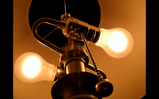
Craft: I used my GE camera, [an end table in my dorm, my countertop, my laptop case, and the concrete] as backdrops, pictured are my purse, a pen, earrings, sunglasses, headbands, a shotglass, playing cards, a cool ball, a tissue box, and the inside of a lamp. I used the camera both with and without flash, and sometimes with the macro setting. 

Wednesday, August 25, 2010

Week 1-Introduction

Hi, my name is Laura.
I am a senior(ish) Sociology major. I may or may not declare a minor in art. After SXU, I want to continue my education with either an MSW or M.A. counseling for careers with the special needs demographic.